")
Introduction
Choosing the right colors for your event theme can be tough, especially when there is no one out there to guide you. There’s more to choosing and combining colors than meets the eye. You have to find the right combination, consider the hues, lighting, and more.
Finding the right colors can set the tone and ambiance for the entire event day. It also puts in the guests’ minds on what the theme is. And a lot of things can go wrong because of this. Fortunately, in this blog post we will share five mistakes people make when choosing colors, along with fixes for these mistakes.
But before that we just want to let you know that it’s alright if you’ve made one of these mistakes. I’m sure many event organizers have made the same mistakes you did. So let it be a learning experience for you. Once you apply the fixes, your event theme will look impressive and your guests will love it!
")
1. Choosing very bright colors
The first mistake event coordinators make when choosing a main or core color is that they choose one that’s way too bright – it hurts the eyes. It’s not good for your eyes and or those of your guests. These colors include pure red, blue, green, violet, orange, and yellow.
Solution:
If you try out a sample and the same thing happens, don’t give up on the color. Simply lighten it a few shades to make it more pleasant – that means picking a color that’s not too bright, just the right intensity.
")
2. Disregarding how light affects the colors
Many event organizers often don’t consider lighting when they choose colors. As a result, it screws up the ambiance of the event. Lighting significantly influences how a color appears and feels in a setting.
If you don’t think about how the lighting in a room reacts with the color you choose, you can end up with a drastically different hue than you planned.
Solution:
Preparation is the key to correcting this problem. Get some paint samples before you decide which shade of color to pick. Then, distribute the color samples throughout the venue and see how the light affects them throughout the day, with both natural and indoor lighting.
You could notice that the color is lighter, darker, or has different undertones than you expected when placed in other areas.

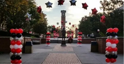
3.Too many colors in the wrong balance
Working with many colors is hard, and achieving the right balance is crucial. There is a place for bright colors which pop out, and there is a place for colors that allow the eye to rest. However, if you have too much of either, the area will become too exciting or too dull. It’s the game of finding the middle ground for colors.
Solution:
Fortunately, there is a simple method that can help you. It’s called the 10/30/60 rule. This concept defines how much shade your color scheme should take up in an area. The first 60% is your core color, which is typically a neutral tone. The following 30% is your secondary color or middle ground, and the last 10% is your accent color, which is the most vibrant shade.
-min")
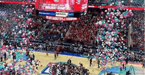
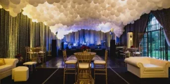
4. Lacking diversity in colors
On the opposite end of the spectrum, it’s also a mistake if you don’t have a variety of colors. The purpose of a color palette is to tell a visual story – to show a style in various colors. However, if you only use one or two colors in a venue, it may begin to appear boring and predictable.
Solution:
Include a few decorations scattered about the venue that has nothing to do with your color palette at all. As a matter of fact, they should contrast with the venue’s colors. They’ll provide additional vibrancy and excitement to the room.

5. Not considering the colors that suit the event
The way a room appears has a lot to do with how it feels. And just because you like a color doesn’t mean your guests will enjoy the ones you picked when they are surrounded by it.
And from what I can see, many people make the mistake of only choosing colors they like and not what colors have to be in the event.
The most important thing is that the colors you choose must match the ambiance and the mood of the event. Or else the gathering will be ruined.
Solution:
You should always choose colors that resonate with the event and not just colors you like. If it’s a Halloween party, select the appropriate colors like black, orange, and so on. When you’re doing Valentine’s event, choosing red or pink as the theme color makes a lot of sense.
Sounds pretty easy, right?

Conclusion
Making mistakes in choosing colors may ruin the entire event if you don’t avoid the pitfalls that I’ve pointed out in this blog. But now that you know the mistakes, you can certainly avoid making them in your events.
Whether you’re just starting and need guidance or have been in the event planning game for years, we can help. If you’re planning for your next event, why not consider adding fun and color to it with balloons! We are the best balloon decorators in North Carolina.
If you’re interested, please visit our website here ? https://carolinaballoons.com/